
Lessons from SaaS in a Parent Section Redesign
/In my last post, I briefly mentioned that Alice and I started discussing a new app. Something that was borne from a recent App Store rejection.
I mentioned, in passing, we were working out how to migrate our existing customers to the new app. As there is a strong relationship between the two, it is important to our business to retain as many of our customers as possible during the transition.
The one teensy, little problem is that we have no contact information for our customers. Ok, it’s actually a major problem. Working around this limitation of the Apple, indie, customer relationship has become our number one priority.
Our problems are further amplified because our apps target children. Children are the users of the apps, but the parents are the customers. We need to attract the attention of the parent, while simultaneously preserving the privacy of the child and complying with COPPA[1].
A Start
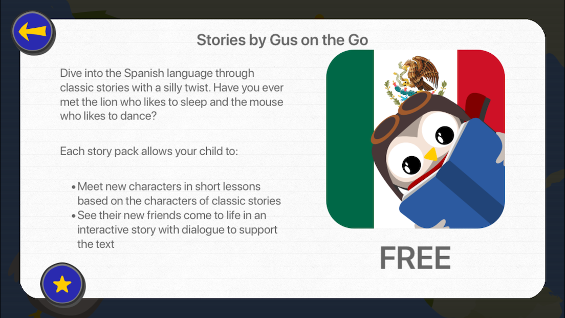
Prior to the rejection, some Gus on the Go apps had a parent section to announce the Stories app for that language.
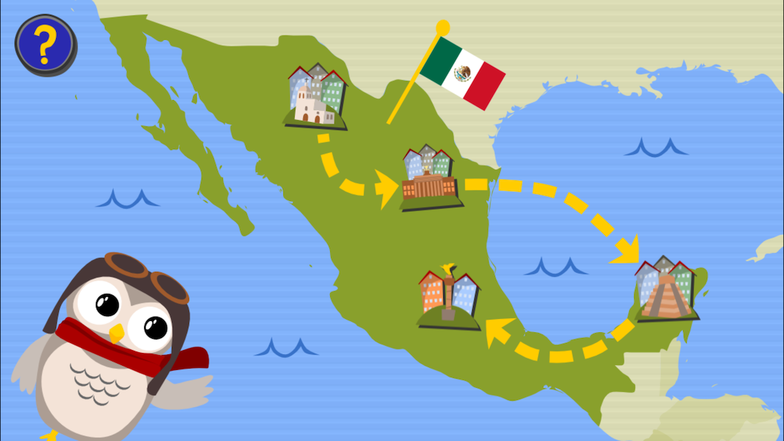
After tapping the question mark button on the main country map, the user is prompted with a parent gate.
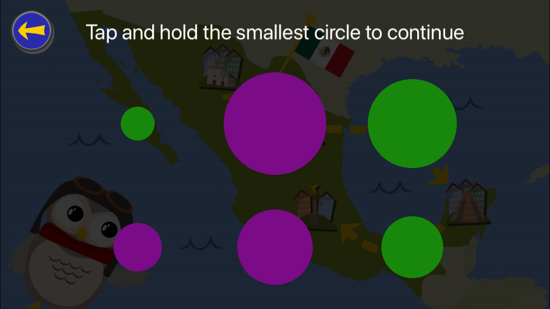
The parent gate is a requirement for children’s apps, which contain links leading outside the app.
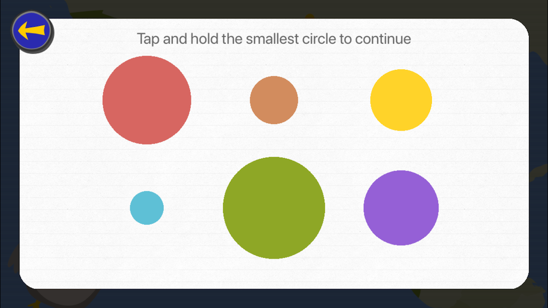
Most children’s apps use a simple addition problem as their parent gate. But honestly, my 4 year old son can do simple addition. He cannot, however, read. So I feel our method is a bit safer for our target age.
After unlocking the parent gate, the user is shown the parent section.
A Redesgin
While technically functional, this parent section had two main problems.
- The parent gate is too early in the flow
- It’s butt ugly
Parent gate placement
The current parent gate placement directly after tapping the question mark button is suboptimal. The user or parent has no way of knowing what information is available prior to unlocking it. We haven’t given them a reason to find out what’s behind it.
The parent gate is not only important, it’s a requirement. However, it’s only required before any action intended for a parent or which leaves the app.
So why don’t we push it later in the flow? Until just before it’s required? This way we can still present app information they need, which doesn’t require them to leave the app. We can also show our marketing copy for other apps that may be of interest.
Only when they tap on a link designed for a parent, the app should present the parent gate.
Design
The design is quite terrible. To be honest, this was done quickly and last minute. It was one of the last features that needed to go into Stories, and the code was just ported over 1:1 to Gus on the Go.
Unfortunately, the initial implementation leaves much to be desired. As a second pass, we cleaned up the colors for the parent gate and added a non-transparent background with a nice lined paper texture to all parent section screens.
A Change of Information
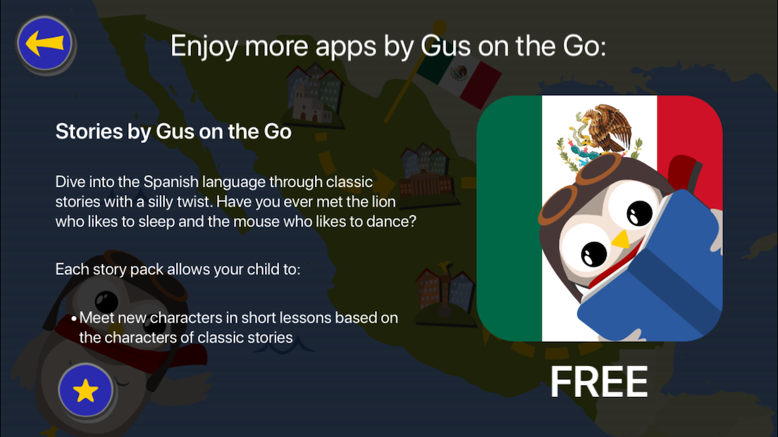
The original goal of the parent section was to announce the availability of the Stories app. In addition, we added a couple of share buttons and a rate button. Partially because people say it’s a good idea and partly because it was easy.
Now that we were creating an entirely new product that doesn’t yet exist, our initial thought was to provide info about the new app once it’s available.
Our focus would be migrating customers to the new app and not getting them to download Stories.
Since the release date of the new app is a huge unknown[2], we want to have the apps ping our server. The server tells the apps when it is ok to link to the new product. Until then, the apps present the original parent section pointing to Stories.
However, is this the best plan? It was the first idea that came to us. Could we do better?
A lesson from SaaS
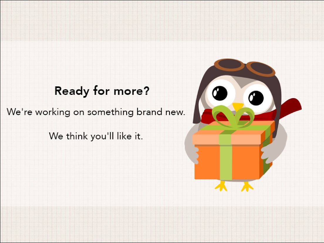
While bringing my one year old daughter to bed one night, something suddenly struck me. We could learn something from the way SaaS companies do business.[3]
Rather than wait for the release of our future product, we could tease it.
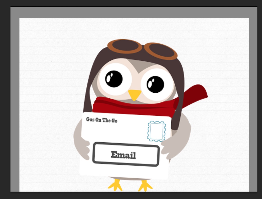
But why don’t we go all in and ask for their email address?[4]
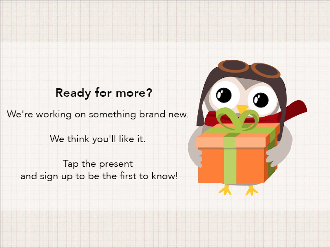
NOTE: these are currently just mock-ups and not yet in the app
We can use this opportunity to build a valuable mailing list for our new, unreleased product. We then have a direct channel to parents interested in what we have to offer.
This was an a-ha moment for me.
Thoughts or comments? I’d love to hear them.
Feel free to reach out on Twitter. I’m @yonomitt.
Have a nice day,
Yono
-
Children’s Online Privacy Protection Act ↩
-
We only have a concept, currently. ↩
-
Attempting to think like a SaaS business is something I took away from Curtis Herbert’s fantastic talk at this year’s Release Notes conference ↩
-
Email entry will, of course, be behind the parent gate. ↩